http://www.amazon.com/Dynamic-Figure-Drawing-Burne-Hogarth/dp/0823015777/ref=sr_1_5?s=books&ie=UTF8&qid=1303748057&sr=1-5
http://www.amazon.com/Basic-Figure-Drawing-Techniques-Painting/dp/0891345515/ref=sr_1_6?s=books&ie=UTF8&qid=1303748057&sr=1-6
http://www.amazon.com/Life-Drawing-Charcoal-Douglas-Graves/dp/0486282686/ref=sr_1_1?s=books&ie=UTF8&qid=1303748140&sr=1-1
Tuesday, April 19, 2011
Class 4/26/11
For class on Tuesday, April 26th, you will need the following:
Completed independent drawing project. Be prepared to discuss your work.
Sketchbooks for review. We will also be awarding two prizes for Most Creative Custom Sketchbook and for Best Sketchbook Content. These will be decided by class vote.
Five of your best figure drawings from the past four weeks. Be sure they are neat, sprayed if necessary, and are clearly signed. If you can't decide I will help you.
SL


Monday, April 18, 2011
Self Portrait


Tuesday, April 12, 2011
Homework this week
Plan to spend 5-6 hours working on your independent and/or final portrait this week, and plan to spend the same amount each week until they are due.
Fairly soon you want to have your large self portrait blocked in the way we were working tonight. I would suggest you have this done by next class. Give yourself a time limit of about 3 hours to map out the drawing and block in BROAD areas of light and shadow.
In addition, spend 15-20 minutes on a simplified drawing of your final self portrait. Do it EXACTLY the way we did our 10-20 minute drawings tonight. Simple, broad values with a minimum of detail. EXPLAIN THE LIGHT. Then, post it on the blog before next class.
Independent drawing and sketchbooks are due April 26.
Final self portraits are due the following week. There can be no extensions.
Sunday, April 10, 2011


Wednesday, April 6, 2011
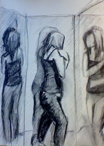
Independent Drawing
Independent Drawing
By Hannah Suh
Project description: Most students (hopefully all of them) miss their family when they are away from home. How would you describe your family members? What particular objects or anything remind you of them? What special memories of them do you have? You will make a drawing that depicts your family or anything that is related to them; it can be representational or abstract as long as it meets the goal. You can choose one of your family members or draw all of them.
Goals: To explore your family, objects related to them, or memories of them.
Materials: Any materials and techniques are possible.
Requirements: The material, scale, and presentation are dependent on what you see your family as.
Methods: Draw an idea map or brainstorming of your family. You may jot down anything that comes in mind. Then decide whether you will draw your family, objects, or memories; of course, you can draw more than one option on a single paper or on more than one.
Develop more than five sketches, build a mock-up from one of those sketches, and put it onto paper or anything you choose to draw on.
On critique day, you will be asked to give a brief presentation of your project.
Tips: Put anything that comes to your mind when you think of your family. Think about what would represent your family effectively.
Be open conceptually. Be creative and bold.
Good luck!
Tuesday, April 5, 2011
Materials for 4/12/11
Please be sure to bring everything you need to do a variety of value drawings. Various charcoal, erasers, good paper, tape, ink, brushes, etc.
Don't forget fixative.
Monday, April 4, 2011


Scratchboard mini-project
Hi Everyone,
I wanted to remind you that I would like everyone to attempt a small scratchboard drawing. I would like it to be something more than just doodles, though the subject matter can be quite simple, like my demonstration. 5" x 7" is fine. You can show it to me at any time between now and the final class.
Here are some further tips - examples will follow:
SCRATCHBOARD TIPS
Adapted from web article by
Russ McMillan
From time to time people have written me for information about scratchboard. I decided it might be helpful to post some general information along with a few tricks. It starts very basic and gets more complex as you go along.
SCRATCHING THE SURFACE
Instead of putting ink down you scratch it off. The surface starts out solid black. When you scratch the surface it leaves a white mark. These white marks should eventually end up creating a picture.
A COMMON MISTAKE
The first mistake people usually make is outlining the object with lines. This is the way it would work with a pencil or pen so they try the same method with scratchboard. They don't get the result they intended.
Maybe they just can't believe they have to scratch away that whole area to create something so simple. Well, I don't know of any other way.
IT'S NOT A NEGATIVE
People often say "So, it's like a negative. You have to train your mind to think in reverse". Not exactly. The fact that I start with a black surface doesn't mean I want a negative image. Technically I am drawing in reverse because I am using white marks instead of black. BUT the result will not be a reverse image. I scratch AROUND any lines that I want to leave black. That is how black lines were defined. I remove what was on either side of those lines.
The highlights still go in the same places as when drawing with ink. Light parts are light. Dark parts are dark. With ink you leave the highlights alone and create shadow with the ink strokes. With scratchboard you leave the shadows alone and create highlights with the scratches.
GET GOOD SCRATCHBOARD
In theory scratchboard is a pretty simple product. A piece of paper or board is coated with a layer of chalky, white material and then sprayed with a thin layer of black ink. Despite the simplicity good quality scratchboard is not easy to find. One of the worst places to look is the local art store.
The scratchboard that most art stores sell is a nightmare. I'm talking about the thin, flexible stuff that has a shiny, black surface and is about as thick as a postcard. On that scratchboard the black layer of ink is too thick and too hard, making it difficult to make clean, delicate scratches. As your scratch blade gets dull it will start to skip on the hard surface. To make matters worse the layer of white clay underneath is too thin. This means that if you scratch too hard or too much the blade will go through the white layer into the paper underneath. It's pretty much impossible to repair. Game over man.
Several years ago I read an article in Step-by-Step Graphics which showcased the work of Mark Summers (Jan/Feb 1992), well-known scratchboard demi-god. Among other things he talked about Essdee Scraperboard as being easy to work with. He was right.
I located some and have been using Essdee ever since. If your local art store can't get it you can order it from Daniel Smith (it's a mail order art catalog) 1-800-426-6740, or Dick Blick (another mail order place) 1-800-447-8192. One of these places tries to make you buy 10 sheets at a time. I can usually talk them out of it but if not I call the other number. It's about $14 for a 19" x 24" board. That seems expensive but I don't work very large so I usually get at least a dozen illustrations out of each board, sometimes more. Working large on scratchboard can get tedious so I work at the smallest size I can get away with.
This scratchboard is well worth the price. The matte black ink is thin enough for easy scratching. The white clay layer is thick enough to allow multiple corrections. I also like the fact that the board is stiffer and thicker than the cheaper scratchboard. I would never use anything else now that I've found it. It also comes in white but I prefer to have it already inked. Thanks a million, Mark.
SCRATCH TOOLS CAN BE BASIC
I have never used the specialized scratchboard tools. I think they are way too expensive for being just sharp pieces of metal. I like the #16 Xacto blade because it is much cheaper than specialized scratchboard tools and it still works great.
I can vary the angle of the #16 blade to make thinner or fatter lines, as needed. A lot of people use the standard Xacto blade (#11) but it's too pointy for me.
The other tool I like is a sharpened steel point (above). I don't use it very often but I sometimes need it with a ruler for making nice straight uniform lines. When I do freehand lettering (my name) I will often start it with my steel point for better control.
PENS
If I make a mistake I don't worry too much. I can usually use a pen to cover it up and then redo it. There is an art to doing this that just comes with practice. Also, I like to crosshatch scratched lines with ink lines to add texture.
I started out using rapidograph type pens but the layers of ink got pretty thick and flaky when I would rework an area several times. I also hated dealing with the problem of getting rapidographs to work without clogging up. I hate using them for scratchboard.
Pigment pens are much better. Pigment ink lays down very black. It's also very thin so it doesn't build up layers. I use the Staedtler Marsgraphic Pigment Liner and the Sakura Micron Pigma. The Sakura also comes in a brush tip.
Pigment pens tend to clog up with scratch dust sometimes so it's good to have at least three. Just cap a clogged one for a while until it's ready to go again. The pens with brush tips don't clog and are great for making larger corrections. The flexible brush tip is difficult to use for fine crosshatching. The normal tips are better for this. I usually use size 01 for crosshatching.
Most art stores carry these pens. They are $2 to $3 each. Avoid any kind of pen that would stain the white layer of the scratchboard. This would include anything like a felt tip marker. If the ink stains too deeply it is difficult to scratch back through to white. Usually when you make an ink correction you need to make scratches back through it.
SANDPAPER
Sandpaper can be a real timesaver. I like to use it to get all the extra black off the edges of my illustrations. This can be time consuming with a blade. I use a small piece of fine drywall sanding screen and then finish the surface with 320 grit wet/dry sandpaper.
Sandpaper can also help with some corrections. Sometimes when a scratchboard surface is re-inked the grooves left by the previous scratches give a bumpy look to any new scratches. When this happens I use a tiny piece of fine sandpaper to smooth the surface before re-inking. I am careful not to sand too much.
TRANSFERRING THE DRAWING
So, you have this great drawing that you want to do in scratchboard. How do you get the drawing onto that black scratchboard? There are several methods for doing this. Some work better than others depending on your preference.
Transfer Paper
I have heard of people using colored (yellow I think) transfer paper to get a drawing down. I can't imagine why anyone would suffer through this more than once. Retracing is bad enough but the worst part about this is how fragile the colored lines are. I tried this once and started losing the drawing halfway through the illustration. The lines got brushed away with the scratch dust. Never again.
Ballpoint Pen
In the Mark Summers article he explains a better method of transfer. I have used this with good results. Place or tape your drawing on the scratchboard. Trace the lines of the drawing with a fine ball-point pen. This leaves indented lines on the scratchboard that can't get brushed away. When applying pressure be careful the drawing doesn't shift.
Direct Drawing
This might seem obvious but it wasn't to me at first. If you feel really confident you can draw directly on the scratchboard with a pigment pen. This makes nice lines that show up easily. It's good for simple drawings.
Xylene
When I have a pretty complicated drawing I like to avoid retracing if possible. Thankfully I have figured out a solution for transferring complex drawings. It does take some practice to get it right.
The basic idea is this: if xylene (xylol) comes in contact with the toner on a photocopy the toner gets soft and sticky. The sticky toner will transfer to anything that touches it. When the xylene evaporates the toner hardens back up. This works great for transferring to scratchboard.
For this you need a photo-copied or laser-printed image of your drawing. It actually works best if the image is a mirror image; if not, your image will be backwards when you make the transfer. I often draw on mylar, which is pretty transparent, so I can flip it over on the copy machine.
Get some xylene from a hardware store (about $3 for a 32 oz. can). Position the photocopy of your drawing face-down on the scratchboard. Tape one edge of the photocopy, like a hinge, to the scratchboard--this will keep the paper from shifting. Pull the photocopy back to expose the black scratchboard surface. Put some xylene on a paper towel and wipe it around on the surface of the scratchboard. The surface should be evenly coated and wet, with no evaporation--don't wait too long or it will evaporate. Quickly lay the drawing back down on the scratchboard and rub lightly to make sure the photocopy toner makes contact with the xylene. When you think it's been evenly rubbed down--don't wait too long--then pull the drawing back and the drawing should have transferred. If it doesn't work just use xylene to wipe it off, then try again with a new photocopy.
Once the transfer is made the scratchboard is ready for work. It doesn't take long at all for the toner to harden. In good light the transferred drawing stands out nicely on the black surface of the scratchboard. It is durable and won't brush off.
Xylene is pretty potent smelling so I try to work with it outside or in a place that has really good ventilation. Once I'm done transferring I put the xylene soaked paper towel someplace where it can dry out without bothering anyone--away from windows or doors where the wind could blow the fumes indoors. I try not to get much xylene on my hands. This stuff will dissolve plastics so be very careful.
VARY THE SCRATCHES
I try to make different kinds of scratches on different parts of an illustration. This makes it more fun by giving it a variety of textures.
Franklin Booth (1874-1948) wasn't a scratchboard artist but I look to him for inspiration. He was a master of black and white. In his pen and ink work he always had an incredible variation of textures.
ADDING COLOR
Scratchboard has great charm as black and white art but there are many times when color is required.
I Don't Dare Do This
I take my proverbial hat off to anyone brave enough to apply color directly to the scratchboard. I have tried this with only limited success. The transparent watercolors I have used don't respond well to the scratchboard surface and I can't remove the color once it goes down. I know there are people who can make this work but coloring the original also means you lose the black and white option. I work on a copy.
Watercolor
The easiest method for coloring is to photocopy onto watercolor paper. I like to enlarge anywhere from 130% to 200% to preserve the details. I have been using Fabriano 90 pound watercolor paper because it is smooth and goes through a copier pretty well. I'm sure there are other papers that would work as well. I look for a paper that is very smooth and not too thick. Even the Fabriano paper is too thick to go through many copy machines so I have to find a place that is willing to experiment. Kinko's has a machine that does poster size copies and usually have them run it on that. I bring my paper pre-cut to 11x17.
Once I get a nice copy (or 3 or 4) I just use transparent watercolor to color anything that isn't black. Spray fix is sometimes needed to keep the toner from coming off the paper. Before painting I completely soak the paper in water, then staple it by the edges to a board.
This will assure that the paper will not end up wavy when it dries. after the color is applied the paper should be allowed to thoroughly dry. The artwork can then be removed from the board and the stapled edges trimmed off.
Separate Black Plate
I read that Mark Summers keeps the black plate separate from the color. This allows the black to stay cleaner and sharper when it's printed. He shoots a film positive of the scratchboard and puts it under the paper he intends to apply color to. This goes onto a light table so the black image can be seen through the paper. The areas that need color are then traced onto the paper. The paper is mounted on illustration board and color is applied. When the color is finished the film positive is placed in register over it. I guess the color is then separated without a black plate. The film positive takes the place of the black plate separation.
There are some important steps that would be critical in this process. I think it would be difficult to do without a color house and a patient art director. The results would probably be worth the trouble but I wonder if the same thing could be done with a computer.
Photoshop
I have had fair success with Adobe Photoshop 3.0 as a coloring tool. I don't claim to be an expert in this area. I would like to know more. The biggest problem I have with using computer color is knowing what it will really look like printed. I don't have a calibrated monitor so I have a hard time trusting the results.
When I color with the computer I start out with a scan that has only black and white in it; no grayscale. I always work on a copy and not the original scan in case I ruin it.
With the file still a bitmap (line art) I go to Image Size and change the dimensions and the pixels per inch. This is usually 300 pixels per inch at the size it will be printed. Next I convert the file to Grayscale and then to CMYK. The image is now ready to color and should contain only white and black pixels so far.
Layers are great if there is enough RAM available. Just put the scratchboard layer in front and color the one behind it. The scratchboard layer needs to be transparent so the colors can show through the scratches. Do this by going to the Layers palette, select the scratchboard layer and set it to Multiply in the little pull-down menu. Now when you select the color layer any color you apply should show through.
If layers can't be used I set all the coloring tools to Darken Only and the black stays untouched. Only the white areas are affected when adding the new color.
I don't use the Paintbrush because the color ends up with a tiny feathered edge. If later you want to select that color and delete it you will see a faint outline. I like the pencil because it only applies one solid color. Every pixel it lays down will be the exact same color. If someone else likes the Paintbrush that's okay by me. However, because the Pencil only puts down one color, it's easy to select that piece of color if you need to change or remove it.
Let's say I have used a particular red in various places on the illustration and I want to select all those pieces and change them to another color. I start by setting my Magic Wand to 1. This will allow it to select just one color. Next I select one of those areas of red and under Select choose Similar. This will select all occurrences of that red. I can change it or delete it completely without leaving a fuzzy pink edge because I used the Pencil to apply color instead of the Paintbrush. Of course this is useful only for applying flat color.
Once I get the flat colors down I start to work with the Airbrush and the Dodge and Burn tools to give dimension. I will mask off areas so I don't spray beyond the edges.
Sometimes it's nice to have the scratchboard layer be something other than black. The color I like best is a dark purple or burgundy but lots of things will work. I use the method above to select all the occurrences of black. Just Fill with whatever color works best.
Fractal Painter
I'm told that Fractal Design Painter is the way to go. I must be really dense or something because I can't seem to get started. I have the program. I have the graphics tablet. I have no clue how to get started. Maybe I need a private tutor.
SCANNING SCRATCHBOARD: MY STORY
When I started to do color on the computer I needed a way to get the scratchboard scanned. Getting scratchboard into digital form was not as easy as I had hoped. I had to do a lot of research before I found the answer I was seeking. If my solution isn't unique I can only say that I haven't heard of it elsewhere. I am pretty happy with it. Get ready for a long story.
Having worked in various design jobs I was confident that I could get good scans by doing all the work myself. This turned out to be true, eventually. My main concerns were cost, quality, and complexity. A black and white scan on a desktop scanner seemed to be the simple answer. After all, I wasn't scanning color so all I needed to worry about was scanner resolution. I wanted to end up with line art scans at a pretty high resolution. For nice, sharp edges and details you need to have at least 600 dpi and it is better to have 900 to 1200 dpi.
I was working as a designer/illustrator and had access to several desktop scanners which all boasted between 1200 and 3200 dpi. The false advertising claims of scanner manufacturers is a story for another time. I wasn't very happy with the results. None of them could keep the detail when scanning as line art. Tiny scratches would get lost in solid black. Tiny black flecks would melt into white. I tried scanning as grayscale which did a better job of detecting detail but now everything had fuzzy edges. Instead of tiny flecks of black or white the details were rendered in shades of gray. When I tried to adjust the contrast to get just black and white the detail started to drop out. If I tried to convert it from grayscale to line art the details would just disappear. I was getting really frustrated because I knew it was possible to do what I wanted to do. I have several old books which have the most incredible detail in the engraved illustrations. There had to be a way to reproduce my work without losing so much in the process.
I decided to try a service bureau that had an expensive flatbed scanner. The scan cost more than I really wanted to spend but I was willing to pay it if the quality was good. It wasn't. Their scan wasn't much better than what I had done. I'm sure it could have been much better but the scanner operator wasn't used to scanning work like mine and I didn't want to have to pay him to learn.
I thought about scans from a color house but I would first have to shoot 4x5 transparencies of my work because you can't wrap scratchboard on a drum scanner. The whole process would be too expensive and time consuming.
I still hadn't arrived at a workable solution. I was starting to think I had chosen the worst medium in the world.
Luckily I had changed jobs by now and I was doing a lot with their old LaCie Silverscanner. It was the best machine I had worked with and could scan great line art at 600 dpi if the details were large enough. I decided if I shot my work on a stat camera the details in the enlargement would now be big enough for the scanner to detect. I called an old friend who had access to a stat camera. He said I could use it if I bought my own materials.
In the meantime I had been experimenting with photocopying scratchboard onto watercolor paper for coloring. The office copier was pretty good and gave nice, solid blacks. I was trying to get the enlargement just right and had some copies on plain white paper at about 200%. I started to compare the details in the copy to the original and there wasn't much lost at all. I thought it might work as well as a stat. I scanned it as line art with a high contrast gamma. The details came out excellent. Victory!
SCANNING TIPS
I find that if my enlarged copy is too big for the scanner I can scan it in two sections and splice it together in Photoshop. I wouldn't try to tile more than 2 or 3 sections because it gets difficult to keep a perfect alignment of the pieces.
I always trim one edge of the copy so that it's perfectly parallel to the edge of the art. I align this edge to the edge of the scanner glass. This keeps the image straight on the scanner and translates into a straight, professional looking scan.
Most places don't have a 200% enlargement on their machines so they offer to enlarge it in two steps. I never do multiple generations to get to my enlargement size. I go elsewhere to find a machine that will do it in one shot. It's worth the trouble.
I have been using a photocopier at a nearby university. It's the best self-serve machine I can find. If I couldn't use that I would probably use the Zoomer at Kinko's.
Now that I'm in my own studio I work with a PowerMac 8100/80 and a LaCie Silverscanner DTP. I also have a Bernoulli drive and a Zip drive to transport images. LaCie Scanners are the only ones I have liked so far. Umax and Relysis scanners are junk in my opinion. I have had better results with Microtek and Mirror but not wonderful.
Grayscale images can be saved pretty small but manipulating them can really eat up your RAM. For example I have a scan that is 5 inches by 7.5 inches at 1180 dpi. As a line art scan it saves at 1.2 meg and opens at 6.25 meg. If I convert it to grayscale it saves at 2.4 meg and opens at a hefty 50 meg.
I find it's better to have a lot of RAM than to have the newest, fastest processor. I work with 160 megs of RAM. A speedy processor with 16 megs of RAM is pretty worthless if you want to work with Photoshop. I wouldn't work with any less than 32, which isn't nearly enough for serious work.
BOOKS
I haven't found much about scratchboard on the Internet. The best book I have found on the subject is Scratchboard for Illustration , by Ruth Lozner (Watson Guptill Publications 1990). Along with information about the medium she has compiled an excellent collection of work from the best scratchboard illustrators. I highly recommend getting this book for all the examples of different scratchboard styles. No, I'm not in it.
Subscribe to:
Comments (Atom)